← Back to work
02 / 04
Telstra Wayfinder
The Challenge
1 in 3 Telstra enterprise detractors cited not knowing who to contact as a core frustration. The existing Enterprise Support page offered only passive self-serve links — putting the burden on already-frustrated customers to find the right channel themselves.
The brief: redesign the page to surface the top support topics — mobile, bills, incidents — and route customers directly to the best contact method for their need. As a telstra.com page, this also meant stepping outside TEDUI and learning Able (LEGO), Telstra's consumer design system, from scratch.
My Role
UX to UI Translation
Received early-stage wireframes from UX and translated them into high-fidelity visual designs, bridging intent and execution.
Visual Exploration
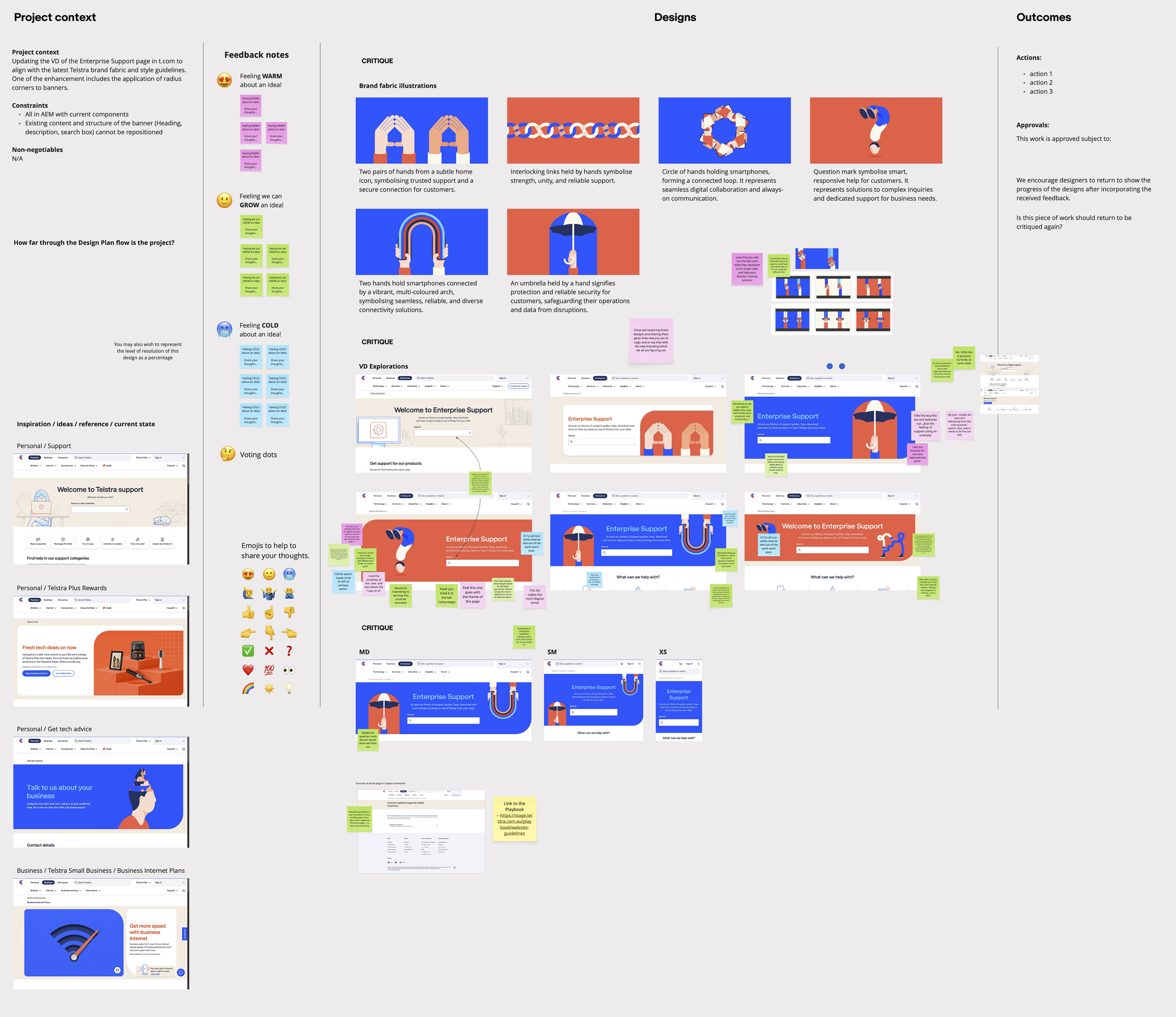
Led two rounds of design critique — exploring multiple banner directions aligned to Telstra's brand fabric, gathering structured feedback to refine the visual approach.
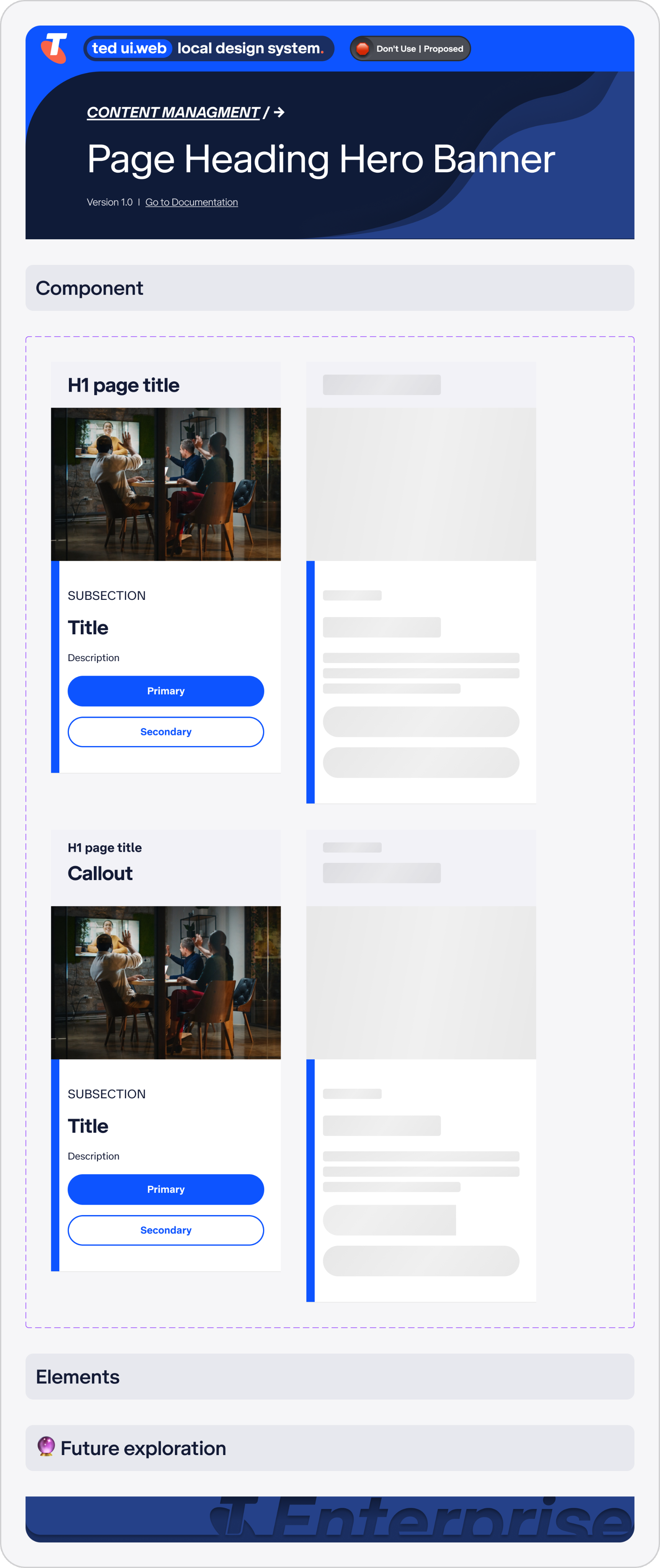
Design System Adaptation
Learned and applied Able (LEGO) — Telstra's consumer design system — independently, adapting to its different structure and conventions outside of familiar TEDUI territory.
Stakeholder Presentation
Co-presented H1 delivery to the board — covering the before/after, design decisions, impact to date, and the roadmap ahead.
Design
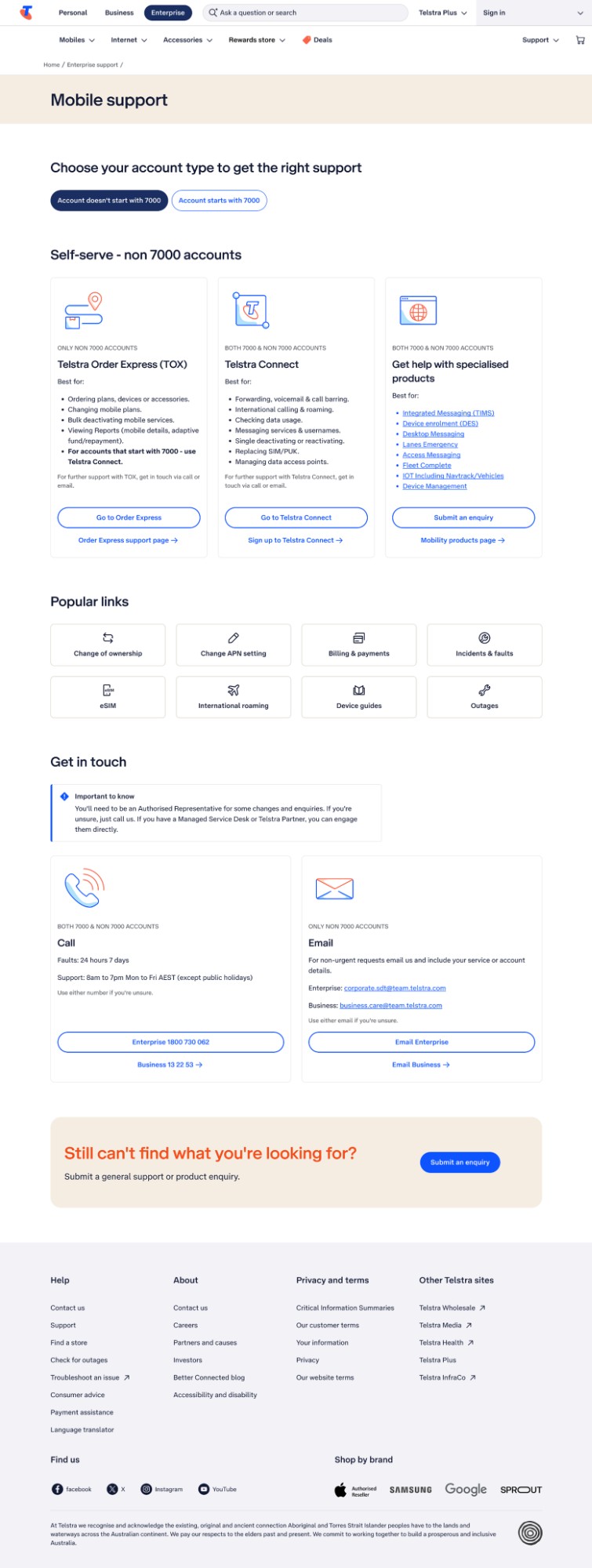
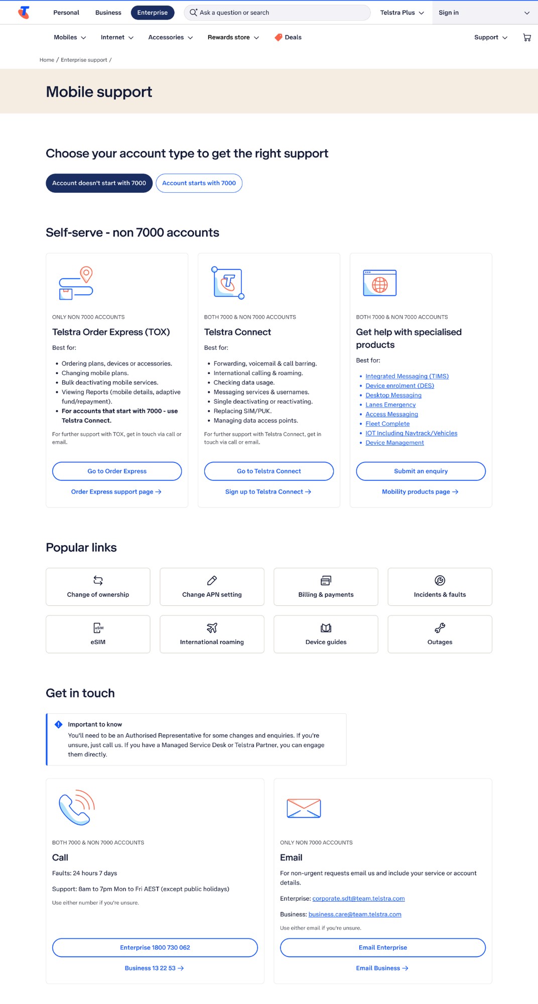
UX Wireframes — the Starting Point
The brief arrived as early-stage UX wireframes outlining the core page structure — top topics, contact routing, and key support tools. My job was to take this skeleton and give it visual life within the Able design system, while ensuring it felt distinctly Telstra.
Design Exploration & Critique
Multiple rounds of structured design critique — the first exploring banner directions aligned to Telstra's brand fabric and style guidelines, the second narrowing from UX reference and inspiration into multiple refined visual options for stakeholder review.
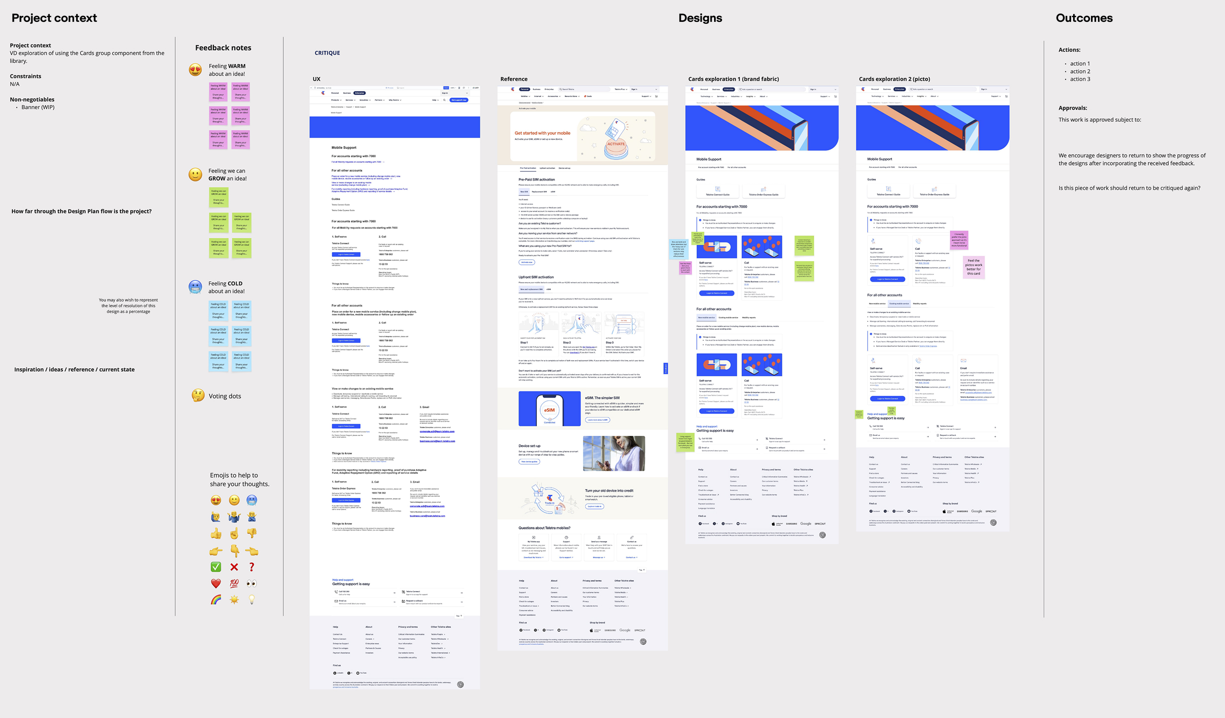
Final Visual Design
The delivered page — topic-led support categories surfacing mobile, billing, and incident enquiries at a glance, with direct pathways to the right contact channel or self-serve tool. Built entirely within Able (LEGO), Telstra's consumer design system.

Outcomes
+81%
Increase in page views following launch — with a 100% increase in unique visits to the redesigned support experience.
↓7%
Decrease in exit rates — customers are staying and finding what they need rather than bouncing.
+50%
Direct increase in lead generation volume — a result of connecting enterprise customers to the right contact channel for the first time.